
Good looking dishes sell faster than plain ones in any restaurant you visit. People decide what to order based on how appetizing items appear to them. Smart tricks can turn basic recipes into showpieces that everyone wants to photograph. Better presentations justify higher menu prices and increase your profit margins significantly. Simple adjustments in plating create lasting impressions that bring customers back repeatedly. Your presentation skills directly affect how much money you make each day.
Why Does Plate Color Selection Matter For Visual Impact?
White plates make colorful foods pop and create clean backgrounds for photography. Black dishes add elegance and work well with lighter colored ingredients served. Colored plates can clash with food and create confusing visuals that turn away. Neutral backgrounds let your cooking shine without competing for attention from diners. Consistent plate colors across your restaurant build brand recognition customers remember easily. Wrong choices make even delicious recipes look unappealing to people deciding what to order.
How Can Strategic Ingredient Placement Increase Appetite Appeal?
Placing protein at the center creates a focal point that draws eyes immediately to it. Surrounding main items with complementary sides guides forks through complete flavor experiences. Random scattering looks messy and suggests lack of planning in your kitchen. Intentional positioning shows thought and care that customers associate with quality cooking. Triangle arrangements create balance while circular patterns feel complete and satisfying to viewers. Thoughtless placement makes dishes look thrown together rather than carefully crafted for enjoyment.
What Role Does Portion Spacing Play In Customer Satisfaction?
Proper gaps between items prevent overcrowding that makes plates look too busy. Touching foods blur together and lose the individual identity that makes each special. Smart spacing allows each component to shine and be appreciated on its own. Crowded plates suggest you tried to cram too much without considering visual harmony. Empty areas frame your food and make presentations look intentional rather than accidental. Poor spacing confuses eyes and makes people unsure where to start eating first.
Can Texture Variety Boost Orders Through Visual Differences?
Crispy garnishes on smooth sauces create contrast that suggests interesting flavor combinations ahead. Mixing soft and crunchy elements shows variety and prevents monotonous eating experiences predicted. Visible textures promise satisfying mouthfeel before anyone takes their first actual bite. Single texture dishes look boring and fail to excite taste buds in advance. Different surfaces catch light differently and add depth to flat looking presentations served. Texture planning separates amateur plating from professional standards customers expect and deserve always.
Why Should Height Differences Be Part Of Every Plate?
Stacking creates drama and makes simple dishes appear more complex than they are. Flat presentations bore customers who see similar things at home cooking daily themselves. Vertical elements add shadows and dimensions that improve photography results shared widely online. Building upward shows skill and effort that justify premium pricing you want charging. Varied heights guide eyes around plates and create journeys through your culinary vision. Everything at the same level looks lazy and suggests rushed preparation without proper care.
How Do Fresh Herbs Transform Ordinary Dishes Into Special Ones?
Green sprigs add life and color that signal freshness to observant customers looking. Herbs suggest natural ingredients and healthy cooking methods people appreciate seeing used today. Small additions like parsley or cilantro cost pennies but increase perceived value greatly. Missing greenery makes plates look bare and incomplete to people used to restaurant dining. Fresh herbs photograph beautifully and create professional appearance customers associate with quality establishments. Dried or wilted garnishes have the opposite effect and damage your reputation instead badly.
What Makes Sauce Techniques So Important For First Impressions?
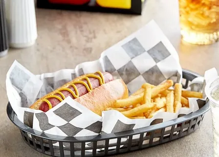
Drizzled patterns show control and artistic ability that separates trained chefs from home cooks. Pooled sauces look sloppy while thin lines appear refined and deliberately placed always. Sauce work can hide minor flaws or draw attention to your best ingredients. Different patterns keep repeat customers interested because no two plates look identical ever. Food basket liner paper underneath catches drips and maintains a clean presentation during the entire service. Messy sauce applications suggest carelessness that makes diners question your kitchen standards overall badly.
Can Diagonal Arrangements Make Dishes More Dynamic Looking?
Angled placements create movement and energy that straight lines simply cannot achieve well. Diagonal cuts on proteins show off interior colors and cooking doneness to buyers. Breaking from rigid horizontal or vertical patterns adds personality to your plating style. Dynamic arrangements photograph better and stand out in crowded social media feeds today. Straight lines feel static and boring compared to angles that suggest action happening. Creative positioning makes your food memorable among hundreds of similar dishes people see.
Why Does Temperature Presentation Build Customer Trust Quickly?
Steam rising proves food just left your kitchen and was cooked fresh minutes ago. Melting cheese or butter shows proper heat that promises delicious flavors coming soon. Cold items need visible condensation or ice that confirms correct storage before serving. WaxPapersHub USA offers solutions that maintain temperature while improving overall presentation quality delivered. Temperature signals build confidence in your cooking process and kitchen management systems used. Missing these cues makes people wonder if food sat waiting too long somewhere.
How Do Color Wheels Guide Better Plating Decisions Made?
Opposite colors create maximum contrast that makes each ingredient stand out clearly alone. Complementary shades work together and create harmony that pleases the eyes naturally without effort in the USA. Understanding color relationships helps you plan dishes that look as good as they taste. Random color choices can clash and create unappetizing combinations that reduce orders placed. Food paper in neutral tones provides a base that lets your colorful ingredients shine properly. Color planning turns good cooks into great presenters who understand visual psychology fully.
Conclusion
Food presentation tricks directly impact your restaurant success and customer satisfaction levels achieved. Small changes in how you plate dishes create major differences in sales. Training staff in these techniques ensures consistency that builds your brand reputation strongly. Visual appeal attracts new customers while keeping current ones coming back for more. Remember that people taste with their eyes before their mouths touch anything. Mastering presentation separates profitable restaurants from those that struggle surviving in competitive markets.


