
Explore The Impact of Color Psychology on Website Conversions
Color is more than a visual element; it is a powerful communication tool that influences perception, emotion, and behavior. In the realm of digital marketing, the colors used on a website can significantly affect user engagement, trust, and ultimately, conversion rates. From the moment a visitor lands on a page, color choices communicate brand identity, guide attention, and create emotional responses that shape decision-making. Understanding color psychology and its practical application is therefore crucial for businesses seeking to optimize website performance.
Color psychology refers to the study of how different hues impact human feelings and behaviors. In the context of web design, it examines how colors influence users’ perceptions, confidence in a brand, and willingness to take desired actions such as making a purchase or subscribing to a newsletter. While design aesthetics are important, the strategic use of color goes beyond beauty, directly impacting usability, accessibility, and behavioral outcomes. For businesses aiming to increase conversions, mastering color psychology is an essential component of digital strategy.
Understanding Emotional Associations with Color
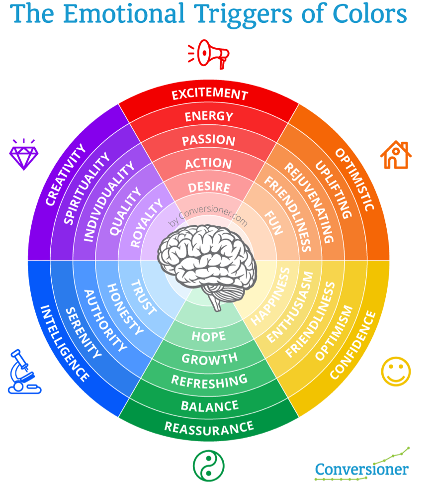
Colors evoke specific emotional responses based on cultural context, personal experience, and even physiological factors. For example, blue is often associated with trust, calmness, and professionalism, making it a popular choice for financial institutions and corporate websites. Red, on the other hand, can evoke urgency, excitement, or passion, which is why it is frequently used in call-to-action buttons and promotional banners.
Green is often linked with growth, health, and tranquility, making it suitable for eco-friendly or wellness-focused brands. Yellow communicates optimism, warmth, and attention-grabbing energy but can overwhelm if overused. Each color carries multiple associations, which may vary across cultures, emphasizing the importance of understanding target audience demographics before implementation.
It is important to note that the combination of colors can also impact perception. Complementary and contrasting color schemes can direct attention, create hierarchy, and influence how users process information. Well-planned palettes reinforce brand identity and improve user navigation, which collectively contribute to higher conversion rates.
Color Psychology in Call-to-Actions
One of the most direct applications of color psychology in digital marketing is in call-to-action (CTA) design. The color of buttons, links, and interactive elements can significantly affect click-through rates. Research shows that contrasting colors that stand out from the rest of the page draw attention to CTAs, guiding users toward the desired action.
For instance, using a bright, bold color for a “Buy Now” or “Sign Up” button against a neutral background can create a visual focal point, increasing the likelihood of engagement. However, the chosen color must align with the overall brand identity and emotional tone of the website. CTA colors that feel dissonant or jarring can reduce trust and discourage interaction.
A/B testing different color variations is a common strategy to determine which combinations yield the highest conversions. Businesses that continuously evaluate user response to color can make data-driven decisions that balance emotional impact with usability.
Cultural Sensitivity and Global Conversions
Color perception is influenced by culture. For example, white is associated with purity and simplicity in Western cultures but may symbolize mourning in some Asian regions. Red signifies danger or warnings in some cultures but represents prosperity and luck in others. Global businesses must consider these cultural variations when designing websites that target international audiences.
Failure to account for cultural associations can reduce user comfort and hinder conversion rates. Localized color strategies that resonate with specific markets enhance the sense of familiarity, trust, and relevance, improving overall engagement and conversion metrics. In this context, understanding regional psychology is as crucial as designing for usability.
Branding and Consistency
Branding is inherently tied to color. A consistent color palette reinforces brand recognition and fosters trust. Users subconsciously associate specific colors with particular brands, creating a mental shortcut that influences behavior. Strong branding through color consistency can increase confidence in a product or service, making users more likely to complete conversions.
In addition, the strategic use of accent colors within a consistent brand palette can guide attention to critical areas of a website. Highlighting offers, forms, or interactive elements ensures that visitors focus on high-priority actions. This combination of brand coherence and visual guidance strengthens overall user experience.
Accessibility and Inclusive Design
Color psychology must be applied alongside accessibility considerations. Not all users perceive color in the same way; individuals with color vision deficiencies may misinterpret or miss important cues. Ensuring sufficient contrast, using multiple indicators for key actions, and testing accessibility across devices are essential steps.
Inclusive design benefits all users, not just those with visual impairments. Clear, accessible color choices improve readability, reduce cognitive load, and enhance overall user satisfaction. This approach ensures that emotional cues conveyed by color are universally interpretable, preventing frustration that could lead to abandoned conversions.
The Role of Color in Trust and Credibility
Users often make split-second judgments about a website’s credibility based on visual impression. Colors play a significant role in forming these initial perceptions. Cool, muted colors such as blues and grays often communicate reliability and professionalism, while overly bright or clashing colors may generate skepticism or appear unprofessional.
Websites that align color choices with audience expectations create a sense of security and trust, which is essential for conversion actions that involve sharing personal information or financial data. Consistent use of trustworthy colors, combined with clear design, reinforces the brand’s integrity and encourages engagement.
Behavioral Triggers and Conversion Optimization
Color psychology intersects with behavioral marketing by influencing emotional triggers. Red may create urgency, while green may suggest opportunity or reassurance. Strategically deploying these colors in banners, notifications, and decision prompts can subtly guide user behavior without appearing manipulative.
By integrating psychological principles with A/B testing and analytics, businesses can quantify the effect of color on conversion behavior. Data-driven insights help optimize color choices, ensuring that visual design directly supports business objectives.
Color in Mobile and Cross-Device Experiences
Mobile users interact with websites differently than desktop users. Smaller screens, touch-based interactions, and environmental lighting conditions can alter how colors are perceived. Responsive color schemes that adapt to device and context help maintain clarity and emotional impact across platforms.
For global businesses with audiences accessing websites on diverse devices, maintaining color consistency and usability across mobile and desktop environments is critical. Mobile-first design paired with color psychology ensures that emotional cues and CTA emphasis are preserved regardless of screen size.
Case Studies and Industry Observations
Organizations that leverage color psychology strategically often see measurable increases in engagement and conversion. For example, e-commerce sites that tested contrasting CTA colors against neutral backgrounds reported higher click-through rates. Financial institutions using trust-associated colors for forms and payment pages reduced user hesitancy, improving completion rates.
Many strategies adopted by Best SEO Companies in USA integrate color psychology into broader UX and CRO frameworks. This holistic approach ensures that color complements layout, typography, and content strategy to maximize conversion outcomes.
Measuring the Impact of Color on Conversions
To quantify the impact of color psychology, businesses must rely on analytics and testing. Metrics such as click-through rate, form completion rate, and time-on-page provide insights into user engagement. A/B testing color variations allows teams to isolate the effect of color from other design elements, creating evidence-based optimizations.
Long-term measurement is essential. Audience preferences can shift over time, and color effectiveness may evolve with cultural trends or industry expectations. Ongoing testing ensures that color decisions remain aligned with user behavior and business goals.
Personal Perspective on Color Psychology
From experience, the most effective color strategies balance psychological principles with brand identity. Overly aggressive or mismatched colors can distract or confuse users, while subtle, consistent choices build trust and guide behavior organically. Observing user interaction data alongside aesthetic judgment provides the most reliable roadmap for color-driven optimization.
Color is an emotional shortcut. When applied thoughtfully, it influences perception, guides attention, and strengthens the overall user journey. Integrating color psychology into design decisions is not about arbitrary preferences—it is about understanding human behavior and leveraging it to create meaningful, engaging experiences.
Conclusion
Color psychology is a critical element in website design that directly affects conversions. From establishing trust and guiding attention to evoking emotional responses, colors influence how users perceive a brand and interact with digital content. Thoughtful application, combined with testing, accessibility considerations, and consistent branding, maximizes the impact of color on conversion metrics.
For businesses aiming to optimize online performance, understanding and implementing color psychology is as important as content quality, technical SEO, or user interface design.
FAQs
1. What is color psychology in web design?
Color psychology studies how colors influence human emotions, perceptions, and behaviors. In web design, it helps brands guide user attention, evoke specific feelings, and influence decision-making, ultimately impacting engagement and conversion rates.
2. How does color affect website conversions?
Colors influence user behavior by creating emotional responses and directing focus. Strategic use of contrasting colors for calls-to-action, trust-building shades, and attention cues can increase clicks, sign-ups, and purchases, directly affecting conversion metrics.
3. Which colors build trust on websites?
Cool and muted colors like blue, gray, and white are commonly associated with trust, professionalism, and reliability. These colors help users feel confident interacting with the website, especially during sensitive actions like sharing personal or payment information.
4. How can red and green be used for CTAs?
Red often evokes urgency and excitement, making it effective for promotions or limited-time offers. Green conveys growth, reassurance, and positivity, which can encourage users to proceed confidently with actions such as subscribing or completing purchases.
5. Why is cultural context important in color choice?
Color perceptions vary by culture. For example, white signifies purity in Western cultures but may symbolize mourning in some Asian countries. Global businesses must tailor color choices to cultural expectations to ensure emotional alignment and maximize conversions.
6. Can color combinations influence user behavior?
Yes, complementary or contrasting color schemes guide user attention, create visual hierarchy, and improve readability. Proper combinations help users quickly identify key elements like buttons, links, or notifications, improving interaction and conversion potential.
7. How does color impact mobile usability?
On mobile devices, color cues must remain visible and clear despite smaller screens and variable lighting. Responsive color application ensures that CTAs, highlights, and text maintain contrast and legibility, preserving usability and engagement across devices.
8. Is A/B testing necessary for color optimization?
Absolutely. A/B testing allows businesses to evaluate which colors resonate most with their audience. Testing different hues, contrasts, and placements provides data-driven insight into how color affects clicks, engagement, and conversion behavior.
9. How does color relate to branding consistency?
Consistent use of brand colors across a website reinforces recognition, trust, and identity. Strategic color application in line with brand guidelines helps create a cohesive experience, guiding users intuitively while supporting credibility and conversions.
10. Are there risks to misusing colors in web design?
Yes, improper or excessive use of colors can overwhelm users, reduce readability, and harm trust. Inconsistent or culturally inappropriate colors may confuse audiences and negatively impact conversion rates, emphasizing the need for thoughtful, strategic application.