
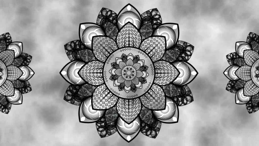

Colors in art do more than provide visual appeal; they shape the way viewers think and feel. Black mandala art designs, for instance, use contrast and intricate patterns to create a sense of focus, reflection, and emotional depth. Bright or muted hues can evoke excitement, serenity, or tension, affecting mood without conscious awareness. Artists leverage color to communicate meaning and guide perception, making it a critical tool in storytelling. Understanding these effects allows viewers to connect more deeply with a piece and experience its intended emotional impact.
Mood and Emotional Impact
Colors have a direct connection to emotions. Warm tones like red, orange, and yellow often inspire energy, passion, and urgency. Cool tones such as blue, green, and purple evoke calmness, relaxation, or introspection. Artists choose specific colors to influence how the audience feels when observing their work. Subtle shifts in hue or saturation can amplify tension or create harmony. By carefully considering emotional associations, creators craft a visual language that communicates feeling without words, ensuring viewers respond instinctively to the intended mood and atmosphere of the artwork.
Cognitive Effects of Color
Certain colors can enhance mental processes, including concentration, creativity, and clarity. Yellow encourages problem-solving and stimulates thought, while blue promotes focus, reflection, and calm. Artists and designers strategically use color to shape cognitive engagement, helping viewers interpret patterns, movement, and forms more effectively. Even abstract or non-representational art relies on color to guide mental processing. Understanding the cognitive effects of hues allows creators to craft works that inspire contemplation, insight, and imagination, making color an essential tool for influencing perception beyond purely aesthetic value.
Cultural and Symbolic Meanings
Colors hold different symbolic meanings across societies. White might represent purity in some cultures while signifying mourning in others. Red can convey luck, passion, danger, or power depending on cultural context. Artists must balance these symbolic associations with their personal intent to communicate effectively. Awareness of cultural meanings allows viewers to interpret artwork on multiple levels. Integrating these associations can evoke shared experiences or provoke reflection, adding depth to the piece. Color symbolism ensures that an artwork can resonate universally while maintaining cultural sensitivity and emotional clarity.
Color Combinations
- Complementary colors create visual contrast and draw attention
- Analogous colors evoke harmony and smooth transitions
- Monochromatic schemes highlight depth and focus
- Triadic palettes provide vibrancy and balance
Thoughtful combinations of colors shape perception and guide emotional response. Contrasting hues create energy, emphasizing specific elements, while harmonious combinations bring unity and flow. Artists experiment with arrangements to highlight symbolism, direct attention, and create immersive experiences. Each palette affects mood, visual balance, and psychological impact. Understanding these principles helps viewers appreciate subtle nuances in artwork while providing artists with tools to convey complex feelings and narratives through carefully selected color relationships.
Physiological Responses
Colors can elicit measurable physical reactions. Red often raises heart rate and stimulates alertness, whereas green induces relaxation and lowers stress. Blue may slow breathing, supporting focus and introspection. Such physiological effects explain why color can make art feel immersive or intense. Artists manipulate hue, saturation, and brightness to evoke desired bodily responses. These subtle interactions between color and physiology deepen the viewer’s engagement, creating a multi-sensory experience. Awareness of these effects ensures that color in art not only influences perception but also produces tangible, physical responses that reinforce emotional impact.
Color in Therapy and Mental Health
Art therapy leverages color to support emotional expression and healing. Bright tones can inspire optimism and energy, while darker or muted shades promote introspection and processing of difficult emotions. Colors help individuals articulate feelings that may be difficult to verbalize. Therapists and artists intentionally select palettes to influence mood, reduce anxiety, and foster self-awareness. The therapeutic impact of color demonstrates its power to affect mental well-being. Understanding this relationship allows both practitioners and artists to create visual experiences that support emotional balance, enhance creativity, and provide a safe space for personal growth.
Conclusion
Colors in art extend beyond aesthetics to shape emotion, thought, and perception. Warm hues generate energy and passion, cool tones foster calm and reflection, and thoughtful combinations guide attention and mood. Artists who understand cultural, cognitive, and physiological effects can craft immersive works that resonate deeply with audiences. Color becomes a universal language, communicating meaning without words. By observing and appreciating these effects, viewers experience art on a profound level, recognizing the subtle yet powerful influence that colors have on perception, emotion, and mental states.
FAQs
How do colors in art affect mood?
Colors influence emotion directly. Warm tones energize and excite, while cool tones promote calmness and reflection, shaping how viewers feel when observing a piece.
Can color combinations alter perception?
Yes, complementary, analogous, monochromatic, and triadic schemes guide focus, harmony, and emotional response, allowing artists to direct attention and create impact.
Do cultural meanings of color matter?
Absolutely. Different societies interpret colors uniquely, affecting how an artwork communicates emotion and symbolism across audiences.
How does color impact mental focus?
Colors like yellow and blue enhance concentration, reflection, and problem-solving abilities, subtly shaping how viewers engage cognitively with art.
Is color used in art therapy?
Yes, colors help express emotions, reduce stress, and encourage introspection, supporting mental well-being and personal expression in therapeutic settings.